Bridging the Gap: Collaboration Between Designers and Developers
Dec 19, 2023

Introduction:
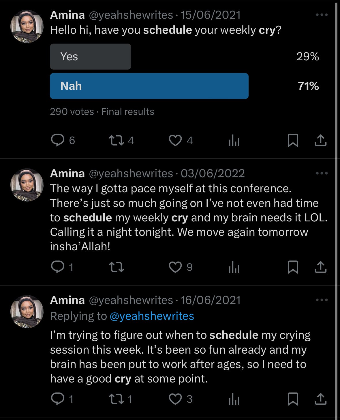
2021/2022 took a toll on all of us. It was the year when everyone seemed to tweet about crying or contemplating a weekly/daily cry schedule. I gave it a shot too, trying to allocate specific days just to let it all out.
Amidst the Twitter banter, I noticed people openly sharing their journeys of overcoming hardships and challenges. Motivated by these conversations, I chose to harness that energy and create something fun, and enjoyable.
Although I got the idea to work on this in 2022, i couldn’t bring myself to flesh it out properly. 2023 has topped the s̶h̶e̶g̶e̶ hardship we collectively saw in 2022. This nudged me to pick this project back up, flesh it out and come up with something I can be proud of.
The ‘alot’ platform is a space where people could connect, empathize, and share their journeys through life’s challenges. The primary focus is to showcase stories of everyday people, our struggles no matter how mundane and to create a supportive community people can look forward to being a part of.
Amina seems to be a schedule your cry pioneer and I would say her tweets inspired me to do this ❤️
Challenge:
There’s a lack of a dedicated platform where people can share, connect, and draw strength from collective experiences. Passive conversations are happening every day on Twitter and other social platforms, and it becomes increasingly challenging to keep up with meaningful exchanges.
Many times, I found myself scouring social media in search of others who might be going through similar experiences, hoping to learn how they navigated through those challenges and I always meet a dead end. I’m aware that I’m not alone in facing this difficulty, and it underscores the need for a more streamlined and supportive space where people can openly share, connect authentically, and find solace in shared experiences.
Pain points:
From studying people online I was able to deduce the following pain points:
Isolation and loneliness: People going through challenges experience a sense of isolation and loneliness. Social media platforms may not provide the depth of connection needed during difficult moments.
Lack of tangible support: there is no dedicated platform where users can find practical advice, resources, and genuine support to navigate their specific challenges.
Absence of humor in supportive spaces: Lots of support platforms lack a light-hearted approach, making it challenging for users to find moments of joy or humor in adversity.
Gains:
What people could gain from a platform like alot:
Community Connection: ‘alot’ addresses the pain of isolation by fostering a sense of community where users can connect with others facing similar challenges, creating a network of understanding and empathy.
Empowerment Through Shared Experiences: Users will gain a sense of empowerment by sharing and listening to stories by others. This will break down challenges into manageable, relatable experiences.
Humor as a Coping Mechanism: The incorporation of humor into the platform serves as a unique offering, providing users with moments of levity and laughter, which can be powerful coping mechanisms during tough times.
Practical Resources: ‘alot’ offers a solution by curating a resource hub filled with resources that could help people navigate through their experiences.
Language and tone of voice:
The language and tone of voice for ‘alot’ embodies empathy, inclusivity, and a genuine understanding of the challenges people may be facing.
Here are key things I put into consideration:
Inclusive and Welcoming: I aim for the platform to offer a sense of belonging by using inclusive language. I want everyone, regardless of their background or experiences, to feel welcome and accepted.
Empathetic and Compassionate: The platform aims to acknowledge the emotions and struggles of everyone without judgment.
Humorous and Light-hearted: Humor is integrated to provide moments of light-heartedness.
Clear and Accessible: The platform uses language that is clear and easily understood.
Resourceful and Informative: The platform will provide information and resources straightforwardly and helpfully.
Typography/Font:
I was looking for typefaces that embody strength, style, and readability while evoking a distinctive emotional tone, I selected Grifter and Euclid Circular A. These are also not commonly used typefaces either 🙃
Grifter is a strong typeface, captivating the audience with its bold presence. It’s also stylish and adds a touch of sophistication to the entire platform.
Euclid Circular A brings a unique blend of geometric precision and approachability. The roundedness of the typeface softens the overall aesthetic, ensuring readability and friendliness without compromising on style.
Combining these two — Grifter and Euclid Circular A — proves to be a perfect match for my aesthetic for “alot.”
Illustrations:
As mentioned earlier, humor is integral in the essence of why I envisioned “alot.” Exploring ways to infuse humor into the project, I considered leveraging illustrations as a delightful complement to witty copy. This approach aims to engage and amuse, ensuring that humor becomes an integral and memorable aspect of the overall experience.
I was lucky to have found a collection of wonderful illustrations by Leremy sticky figures. Finding these illustrations, including those from random collections, significantly enhanced my vision for “alot.” The creative process involved a journey of mixing and matching illustrations to craft an engaging narrative and achieve my desired objective.
In some parts of the design, you will see clouds, shards, cracks, red eyes, and potholes. These are strategically placed to drive home the point and entire idea of alot. These cracks represents what we are going through, the clouds represents the heaviness of the heart, red eyes depicts the level of hardship someone has seen or is anticipating to see (lol) and the potholes are just generally there to enhance how crooked life is.
This process was a true labor of love and I hope the outcome will evoke the same excitement in you as it does in me.
Colours:
If you are familiar with my fun projects, you will know that I have a preference for dark mode with a touch of green. This project allowed me to step into the realm of using multiple colors. This was very challenging for me and also marked my first attempt at blending colors against my usual preference.
The selected palette, although warm, treads the delicate line between moody and lively. Beyond their attributes which I have highlighted below, these colors work seamlessly to tie together my vision for alot.

The attributes:
EAD0A3 (Light Beige):
Attribute: A light beige or sandy color.
Potential Attributes: Neutrality, Simplicity, Warmth.
Why It Works: This color provides a neutral and calming backdrop, creating a balanced visual environment. It can also convey a sense of warmth and approachability.
BF6058 (Reddish-Orange):
Attribute: This color is a warm reddish-orange tone.
Potential Attributes: Passion, Energy, Playfulness.
Why It Works: It can evoke a sense of enthusiasm and vibrancy, making it suitable for capturing attention and conveying a lively mood.
5EA898 (Teal-Green):
Attribute: A cool teal-green shade.
Potential Attributes: Tranquility, Balance, Nature.
Why It Works: This color choice brings a refreshing and calming element, suitable for creating a sense of balance and connection with nature.
AA6890 (Mauve-Purple):
Attribute: A muted mauve or dusty purple.
Potential Attributes: Sophistication, Subtlety, Elegance.
Why It Works: The muted purple can add a touch of sophistication and elegance to the color palette, while maintaining a subtle and calming presence.
1B1A18 (Charcoal Gray):
Attribute: A deep charcoal gray.
Potential Attributes: Timelessness, Mystery, Versatility.
Why It Works: Charcoal gray is a versatile and timeless color that can provide a sense of mystery and depth, adding a classic touch to the overall palette.
4E97B7 (Steel Blue):
Attribute: A medium to dark steel blue.
Potential Attributes: Stability, Depth, Trust.
Why It Works: This color brings a sense of stability and depth, adding a trustworthy and reliable component to the palette.
In the design, you will see how and why each of the above colors works for the pages I have used them in.
Style and layout:
Selecting a landscape view(aka vertical scroll as opposed to the usual horizontal scroll) for this project was a deliberate choice aimed at elevating the user experience. The landscape view offers a broader canvas, gives room for a more immersive visual flow and a more natural scrolling experience(imo).
The button style decision lacks a structured thought process 🙃, it reflects a personal touch and preference.
Design:
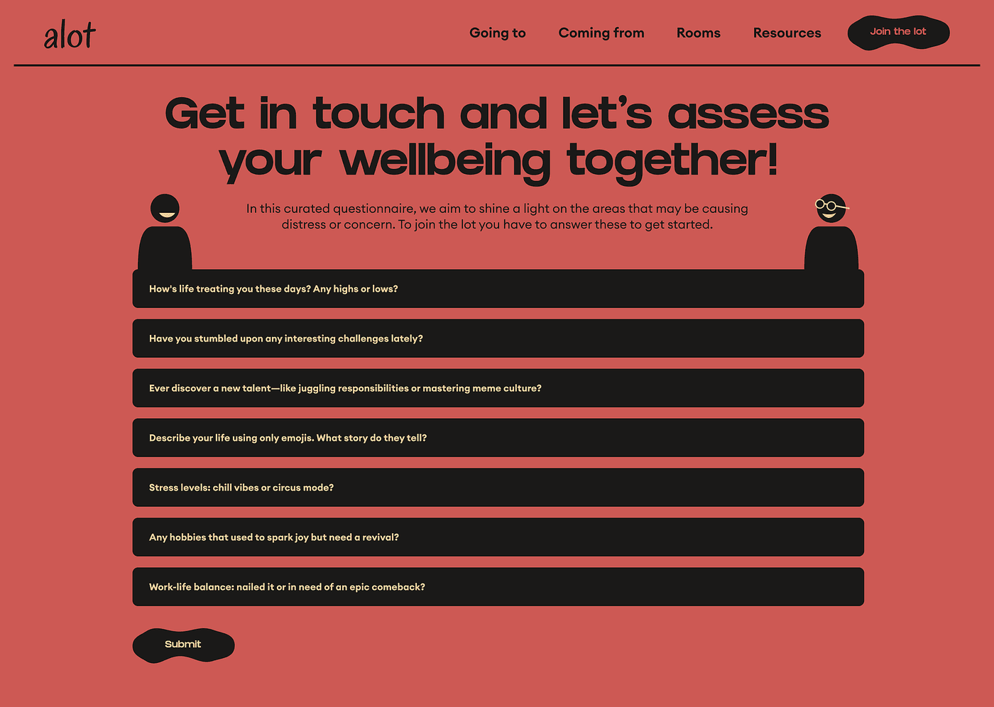
The overall design strives for simplicity. The concept is straightforward: visitors come, enjoy the content, share their experiences, and continue on their journey. Notably, there’s no sign-up or sign-in process. Instead, users are prompted to answer curated questions that will help us gauge their current state of well-being.
The platform consists of five pages/sections:
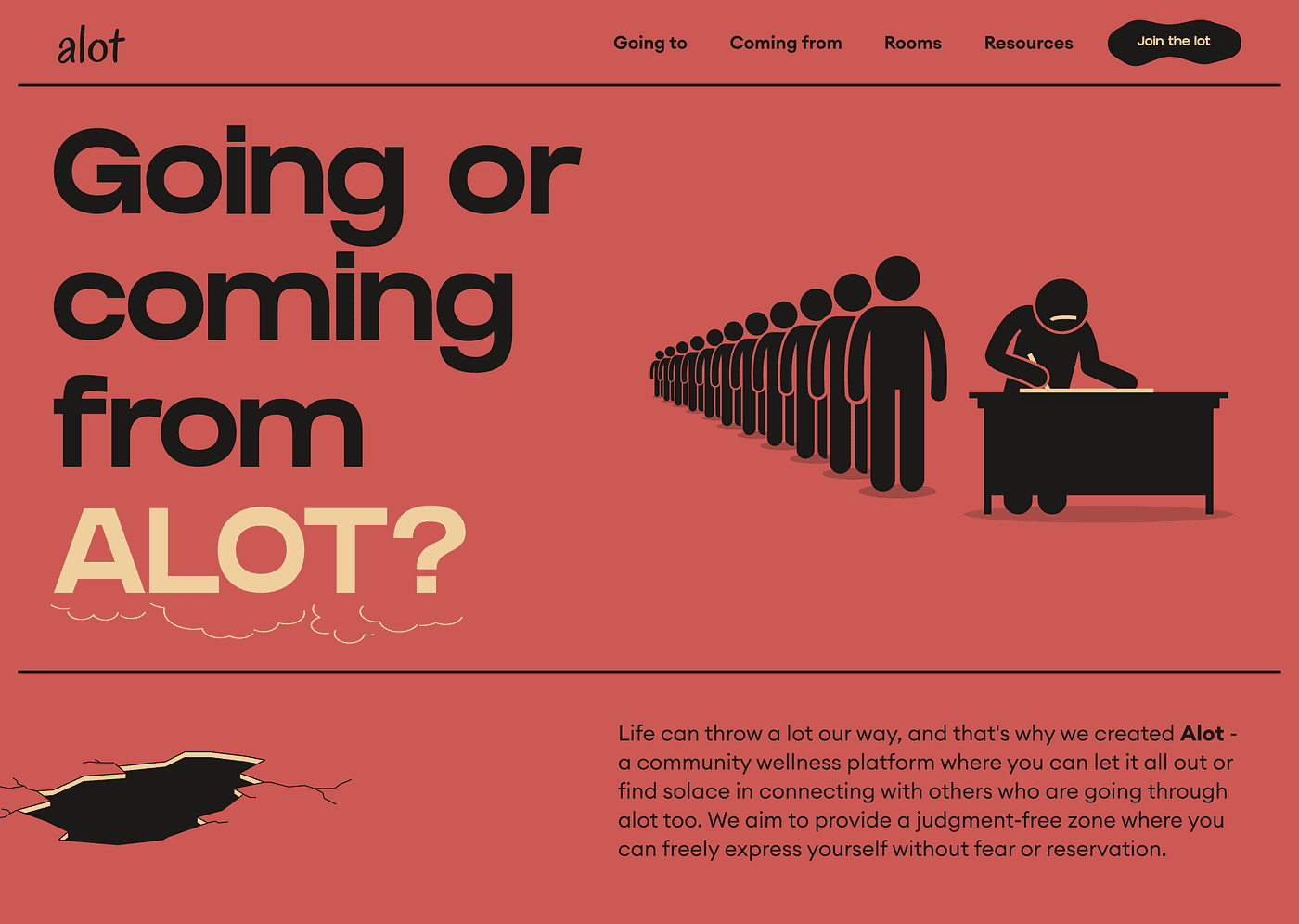
Home: This serves as the welcoming introduction, where users initially land. The copy is warm and inviting. The accompanying illustration portrays people in the act of marking a register, symbolizing a community, inviting you to join the line.
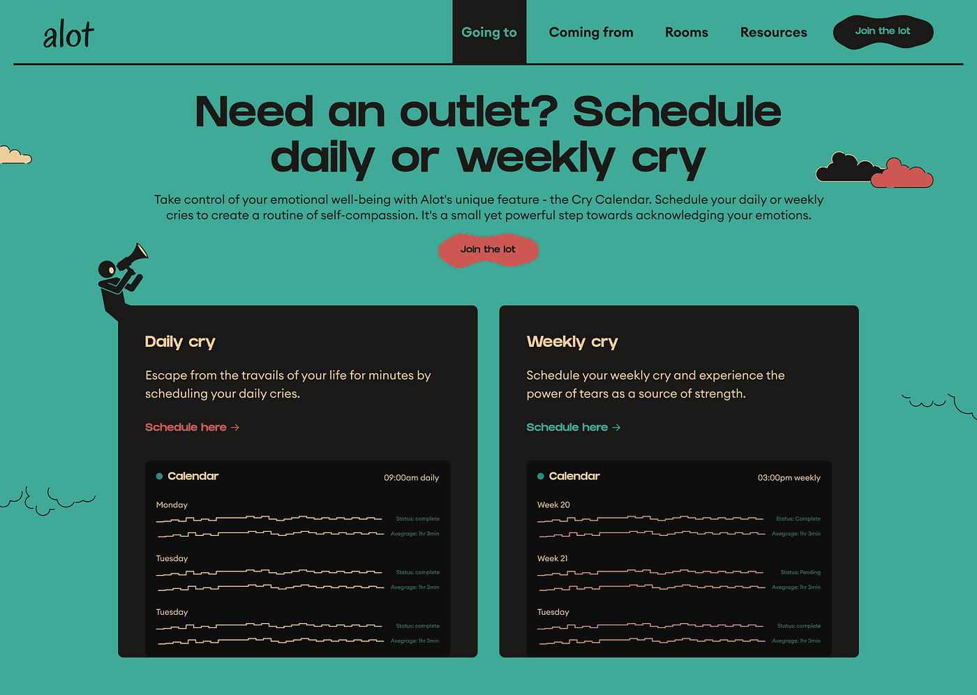
Going To: This section is where we have the cry calendar. You can schedule your weekly or daily cry, others can see your schedule and join your room if the topic interests them enough.
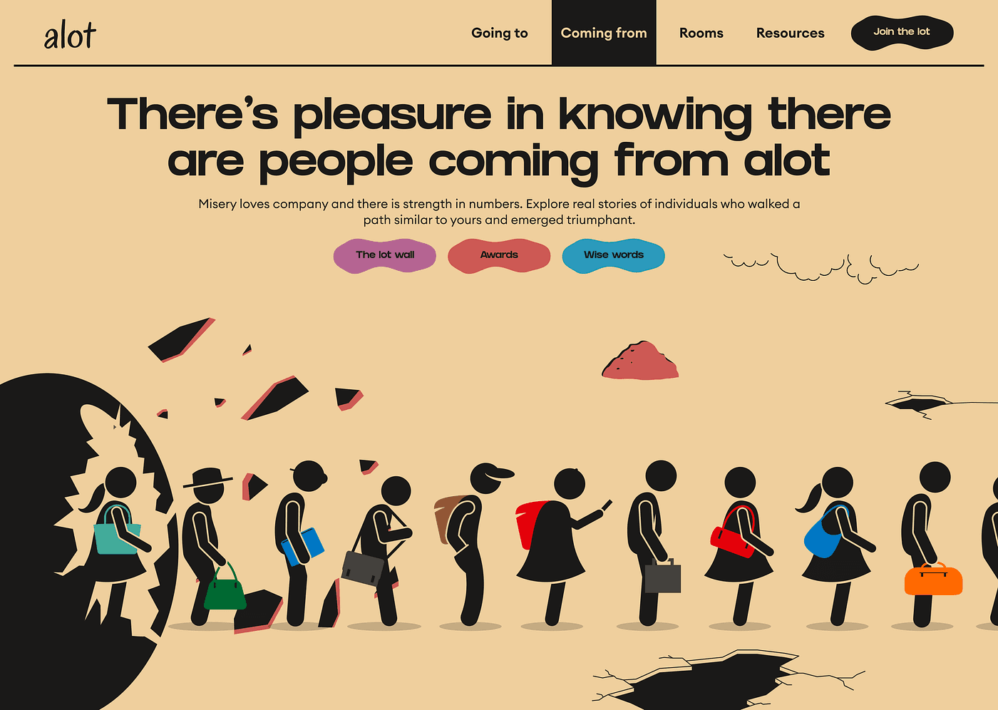
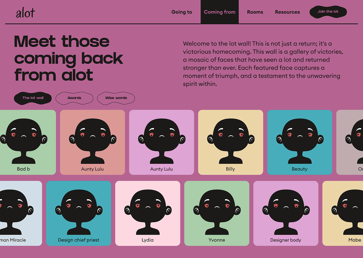
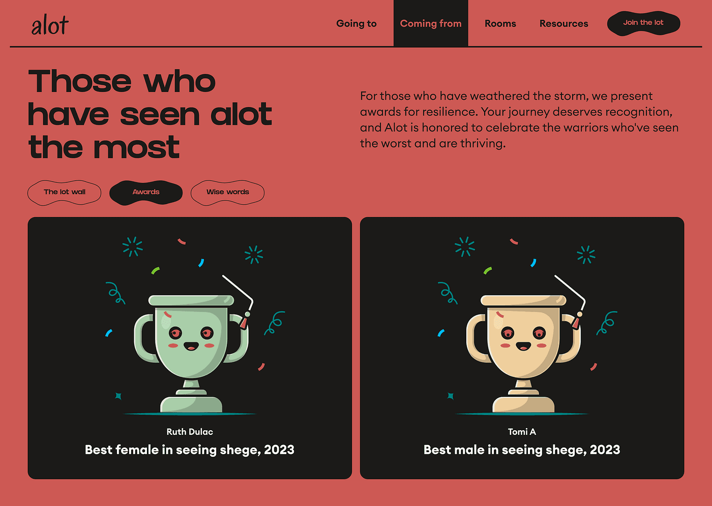
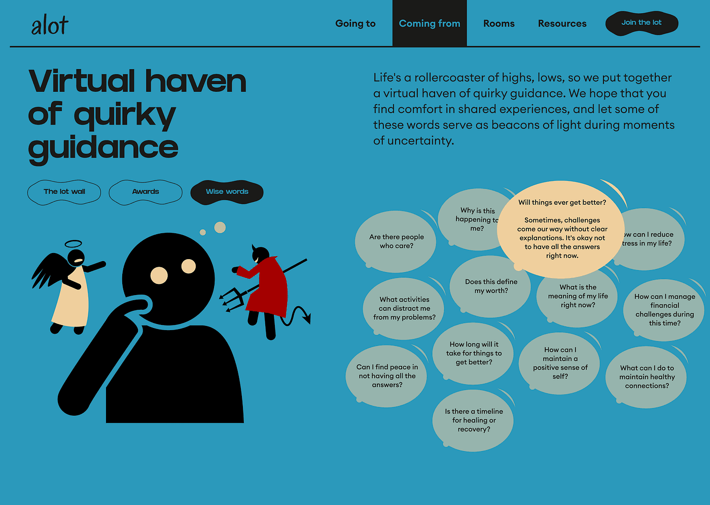
Coming From: Misery loves company and there is strength in numbers. This section have sub-sections or pages: the lot wall (where you see everyone who just came back from alot), awards (here the best male and female ̶i̶n̶ ̶s̶e̶e̶i̶n̶g̶ ̶s̶h̶e̶g̶e ̶i̶n̶ ̶̶ in going through alot are awarded by community members), wise words (words of encouragement from our support team and those who are coming back from alot)
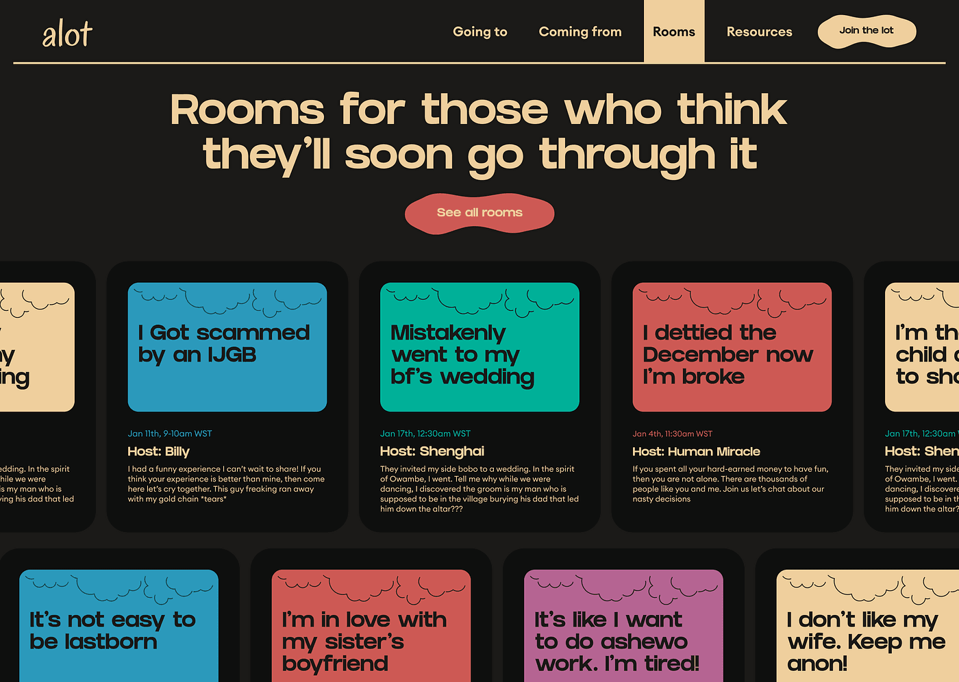
Rooms: This is a dedicated page for those who have joined the lot and are currently going through it. Think Twitter space but more engaging.
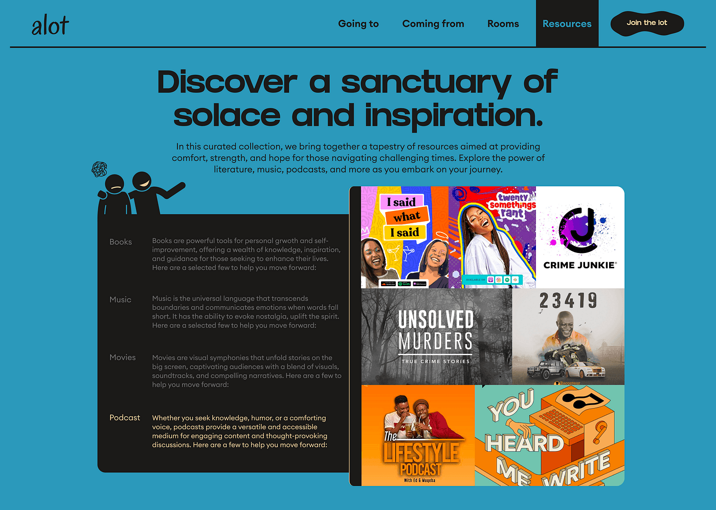
Resources: This is a section/page where we highlight books, movies, podcasts, and music that could help you.
Join the Lot: Instead of a conventional sign-up, this page prompts users to participate by answering questions, facilitating a more personalized and engaging entry into the community.
Proposed Impact:
The primary goal of ‘alot’ is to build a community that serves as a beacon of support for those facing adversity. The platform aims to:
Connect People: Facilitate connections among individuals who have overcome challenges, those currently facing them, and those seeking to offer support.
Share Experiences: Provide a space for users to share personal stories, fostering a sense of solidarity and understanding.
Offer Resources: Curate a hub of resources, advice, and coping mechanisms to assist individuals in difficult times.
Promote Positivity: Infuse humor and light-heartedness into the community to help users find moments of joy amid tough times.
If I were to build this as an actual product, I have more detailed ideas on how to make this work. The world is tough enough and we need a little sunshine to get us going.
I hope you enjoyed this project as much as I did creating it. The best part of this for me was when the illustrations came together. I had nights where I stayed awake trying to mix and match colors, and illustrations and generally just asking myself what the f I was doing.
Figma File
In case you want to check it out for yourself and enjoy the project at your own pace, see the little interactions, here is the Figma file. This is a web version, kindly view on your Laptop/MacBook. There is no mobile version 🥹
NB: This is my intellectual property and I hope you respect it 🧎🏾♀️
Thanks!
